IDB Website Audit Report

Performance, Accessibility, Content Evaluation
Author: Shirley Sosa
Date: 08/10/2025
idb page banner

Overview

This report presents a comprehensive audit of the IDB website, aimed at assessing its current usability, accessibility, and performance. The analysis seeks to identify content, design, and structural opportunities to enhance the user experience and ensure alignment with the IDB’s corporate communication and branding standards.

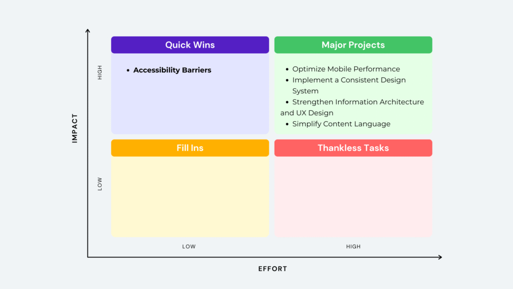
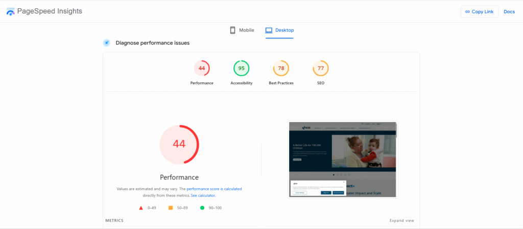
The audit follows a user-centered and data-driven approach, combining heuristic evaluation, accessibility testing, and web analytics to identify usability issues and content inconsistencies. Based on the findings, an effort–impact prioritization matrix was developed to outline actionable recommendations that support continuous improvement of the IDB web ecosystem, reinforcing both institutional coherence and audience engagement.

Design Process

The design process began with an empathy and current-state analysis to understand user needs and navigation behaviors, followed by the identification of key usability and accessibility findings through heuristic evaluation. Based on these insights, an effort–impact prioritization matrix was developed to define actionable recommendations for improving performance, content structure, and alignment with the IDB’s corporate communication and branding standards.

1. Empathy Analysis

Identify user needs and improve usability, accessibility, and website performance.

2. Findings & Insights

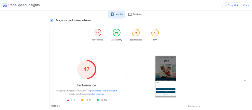
Summarize usability issues, content inconsistencies, and performance opportunities.

3. Recommendations & Prioritization

Propose actionable improvements using an effort-impact matrix to guide implementation.

1. Empathy Analysis

Identify user needs and improve usability, accessibility, and website performance.

Market research

To understand the end-user’s context, the ‘Digital 2024’ report from We Are Social was analyzed. This research provides context on the digital behavior, mobile dominance, and connectivity reality of the target audience in the region.
image

The Audience's Main Channel is Mobile, Not Desktop.

96.5% of users access the web through a mobile device. This makes mobile the dominant—and for many, the only—digital communication channel.
image (1)

Slow Connectivity Acts as a Filter of Exclusion.

Average connection speeds in key Latin American markets are significantly lower than in other regions, creating a very different “connectivity reality” for users.
image (2)

There is a Risk of Internal "Connectivity Bias".

The website experience is often tested from offices with high-speed, fixed internet connections. This does not represent the reality for most external users.

Performance Evaluation

This performance evaluation measures the technical efficiency and user experience of the IDB website. The analysis focuses on loading speed and Core Web Vitals to identify optimization opportunities and ensure an inclusive experience.

Performance Analysis: Key Findings

1. The mobile experience is critically slow and fails essential loading metrics.
  • The website fails the Core Web Vitals assessment on mobile devices.
  • The main content (LCP) takes 15.6 seconds to load on mobile, which is 6.5 times slower than the 2.4 seconds on desktop.
  • The First Contentful Paint (FCP) on mobile is 5.8 seconds, meaning users see a blank page for too long.
  • The overall mobile performance score is 47 out of 100.
2. The main cause of the poor performance is the page’s excessive size, especially due to unoptimized images.
  • The total page size on the desktop test was 4,865 KiB, which is considered an “enormous network payload”.
  • PageSpeed Insights estimates that optimizing images could save up to 2,778 KiB on desktop and 1,044 KiB on mobile.
  • Reducing unused JavaScript could save an additional 441 KiB on both versions.
  • The overall mobile performance score is 47 out of 100.
3. Basic accessibility and SEO errors affect inclusion and visibility.
  • The report finds that “Image elements do not have [alt] attributes,” which makes content inaccessible to screen reader users.
  • The document “does not have a meta description,” which affects how the page appears in Google search results.
  • The audit also found “Links do not have descriptive text,” which creates confusion for users and search engines.
  • Although the automated Accessibility score is high at 95 , the report warns that manual testing is encouraged to find all issues.

Accessibility Evaluation

This evaluation measures the IDB website’s compliance with accessibility standards to ensure an inclusive experience. The analysis combines automated and specialized tools to identify barriers that affect users with disabilities.

Accessibility Analysis: Key Findings

1. 5 critical errors were found that create direct barriers to content.
  • These 5 errors represent serious accessibility issues that fail to meet WCAG (Web Content Accessibility Guidelines).
  • They can prevent users with disabilities, such as those who use screen readers, from accessing information on the site.
2. 126 contrast errors make the content difficult to read for many users.
  • This high number of contrast errors indicates a systemic issue with the website’s color palette, where text is not clearly visible against its background.
  • This impacts not only users with visual impairments but anyone reading the site in bright light, weakening the clarity of the Bank’s communication.
3. Automated tools provide an incomplete view of accessibility.
  • The PageSpeed Insights report showed a high accessibility score of 95.
  • However, the specialized WAVE tool identified 5 critical errors and 126 contrast errors that the initial report did not capture. This shows the need for a more in-depth accessibility analysis.

User Experience (UX) and Usability Analysis

A heuristic evaluation was conducted to identify usability and design issues that affect the user experience on the IDB site. The goal of this analysis is to find opportunities to make the web more intuitive and align it with the institution’s corporate communication standards.
usability heuristics
*Source: Author

User Experience (UX) and Usability Analysis: Key Findings

heuristic 1
  • The site consistently uses breadcrumbs (e.g., Home > Projects > Detail) at the top of internal pages, always showing the user’s current location.
  • This provides clear orientation, reduces the feeling of being lost, and allows for easy navigation to higher-level pages with a single click, giving the user more control and confidence.
heuristic 2
  • The content’s terminology is rated as “difficult.” This creates a comprehension barrier for a diverse audience that is not limited to specialists, such as students and journalists.
  • Symbols and images are used without a logical connection to the text (e.g., a “star” icon for an ATI policy). This causes confusion and reduces the message’s credibility.
heuristic 3
  • The site provides clear “emergency exits,” such as the always-visible logo to return home and the use of breadcrumbs to facilitate navigation to previous levels.
  • Negative: The filtering system in the “Publications” section is confusing, as the applied filters are not clearly visible, preventing the user from knowing which criteria are active. On the “IDB Academy” page, filter visibility is also poor.
heuristic 4
  • The site shows widespread inconsistency. Specifically: Sliders with different interaction behaviors, Varied image styles, Colors used outside of the brand palette, Buttons with different hover effects, Lack of a consistent design hierarchy between sections.
  • This lack of consistency forces the user to learn and question how the interface works on each page. It increases cognitive load, makes the site feel fragmented and unprofessional, and results in a slower, more frustrating navigation experience.
heuristic 5
  • The repetitive and generic use of “See more” for multiple calls to action fails to prevent navigation errors. This forces the user to guess each link’s destination, increasing the likelihood of making a wrong click.
  • A lack of clarity on key buttons, such as the ambiguous “Sign up/Update” for subscriptions and inconsistent banner designs, creates doubt about the resulting action and can lead to user error.
  • While some good practices like search placeholders exist, the lack of a consistent strategy for error prevention on CTAs and buttons degrades the user’s experience and trust.
heuristic 6
  • The site applies good recognition practices in its navigation, such as a persistent menu and a logo that always links to the homepage, which helps with user orientation.
  • However, the user is forced to recall information instead of recognizing it due to cryptic project names like “Project RG-T890,” which fail to describe their content or purpose.
  • The use of “star” icons for unrelated topics breaks recognition standards. This forces the user to learn and recall a new meaning for a familiar symbol, adding unnecessary cognitive load.
heuristic 7
  • The site features an advanced filter system that is clear and functional, allowing expert users to effectively accelerate their searches.
  • However, this efficiency is not consistent. In the “Publications” section, the filter system is confusing and does not show all options visibly, which slows the user down instead of accelerating their task.
heuristic
  • The design is not minimalist and suffers from a poor information hierarchy. Too much information is presented at once, which overwhelms the user and makes it difficult to prioritize important content.
  • This lack of prioritization is evident in multiple visual inconsistencies, such as the use of buttons without a clear hierarchy system (primary vs. secondary). Every element visually competes with the others, creating “noise.”
  • As a result, the interface feels cluttered and unprofessional. The user must spend extra cognitive effort to decipher what is important on each page, leading to a frustrating and less efficient experience.
heuristic 9
  • The site has a custom 404 error page that includes a link to the homepage and four instructions to help the user find what they are looking for. Negative: The main “404 Page Not Found” message is repeated twice, creating unnecessary redundancy.
heuristic 10
  • The site offers a “Contact” page, which is easily found in the footer.
  • The page only provides physical office addresses. There is no contact form or general email address for users to resolve questions directly and digitally.

Content Readability Analysis

To ensure the Bank’s key messages reach a diverse audience, the clarity and readability of the Spanish content was evaluated. This analysis uses linguistic tools to determine if the current language presents a barrier to user comprehension.

Content Readability Analysis: Key Findings

1. The textual content has a high complexity level that makes it difficult to understand.
  • Multiple readability formulas for the Spanish language rate the content as “difícil” (difficult) or “muy difícil” (very difficult). The Spaulding index, for example, gives a score of 185.04, classifying it as “muy difícil”.
  • Complex communication creates a barrier for the general audience, limiting the reach of the Bank’s “stories of impact.” To be truly inclusive, the language must be clear and accessible to everyone, not just specialists or academics. In a mobile context with slow connections, difficult text increases the user’s cognitive load, making it more likely they will abandon the page.

2. Findings & Insights

Based on a user-centered approach that combines heuristic evaluation and accessibility testing, this section presents the key findings. The following details the opportunities to improve usability and content consistency, thereby reinforcing both institutional coherence and audience engagement.
website idb cover

Severe Accessibility Barriers

The website has 5 critical errors that prevent access for users with disabilities and 126 contrast errors that impair readability for all users. This represents the most significant barrier, as it completely excludes certain audience segments.

Critical Mobile Performance

The experience for the majority of the audience is extremely slow, with the main content taking 15.6 seconds (LCP) to load on mobile. This poor performance is a primary cause of site abandonment.

Weak Information Architecture and Hierarchy

The site lacks a clear visual and content hierarchy. The use of cryptic project names (e.g., “Project RG-T890”) and generic links (“See more”) makes navigation difficult and forces the user to struggle to find information.

High Complexity Content

The readability analysis rates the Spanish content as “difficult” or “very difficult” , limiting its reach and comprehension for a diverse audience, including students and journalists.

Design & UX Inconsistency

The site suffers from a lack of consistency in elements like buttons, colors, and sliders. This increases the user’s cognitive load and gives an unprofessional impression.

3. Recommendations & Prioritization

To address the identified findings, an action plan with concrete and actionable recommendations is presented. These have been prioritized using an effort-impact matrix to maximize improvements in user experience, accessibility, and site performance.
effort impact matrix
*Source: Author

Resolve Critical Accessibility Barriers (Priority #1)

An immediate audit and correction of the 5 critical errors and 126 contrast errors detected by the WAVE tool is recommended. This is essential to comply with WCAG standards, ensure equitable access, and remove barriers that currently exclude users with disabilities.

Optimize Mobile Performance

It is crucial to execute a technical optimization plan to reduce the mobile load time, which currently has an LCP of 15.6 seconds. Optimizing images (with potential savings up to 2,778 KiB) and reducing unused JavaScript are the first steps to improve the experience for the majority of the audience and decrease the abandonment rate.

Strengthen Information Architecture and UX Design

It is recommended to redesign the information hierarchy to be clear and consistent. This includes replacing cryptic project labels (e.g., “Project RG-T890”) with descriptive names and unifying calls to action (CTAs) to be specific, avoiding generic text like “See more”.

Implement a Consistent Design System

To address the widespread inconsistency in buttons, colors, and sliders, the development and application of a design system is recommended. This will unify the visual experience, reinforce the IDB’s professional brand image, and reduce the user’s cognitive load.

Simplify Content Language

A content strategy must be implemented to reduce the complexity of the Spanish language content, which was rated as “difficult” (Spaulding index of 185.04). Creating style guides with a focus on plain language is vital to support the Bank’s mission of disseminating knowledge to a diverse audience.
The IDB website has a solid foundation; however, this analysis has identified key areas where improvement will significantly enhance its impact. By prioritizing accessibility, optimizing the mobile experience, and clarifying content, the site can more effectively serve its audience and reinforce the institution’s communication standards. I am confident that with a strategic, user-centered approach, the IDB’s web platform can become a benchmark in its sector. It would be a pleasure to discuss how I can apply my experience to realize this potential.
Shopping Cart
  • Your cart is empty.